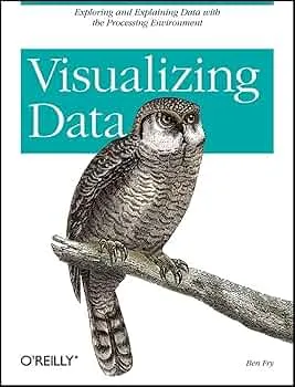
Visualizing Data: Exploring and Explaining Data with the Processing Environment Review
Visualizing Data by Ben Fry is a practical path from raw data to working visuals using Processing. It teaches an engineer’s workflow: acquire, parse, filter, mine, represent, refine, and interact. The focus is on building artifacts that work first and look good because they work.
Overview
The book walks through end to end examples: scraping and structuring data, choosing encodings, writing Processing sketches, and iterating toward clarity. You see how to design data structures, manage performance, and compose interaction without losing the thread of the story.
Summary
Fry introduces a staged pipeline: acquisition and parsing convert sources into usable structures, filtering and mining expose signal, then representation and refinement shape the visual and its interaction. Examples cover maps, networks, time series, and hierarchies. Code is explained in small steps so you understand both why and how.
Authors
Ben Fry co created Processing and helped define modern data visualization as a coding discipline. His writing is terse and functional. The examples favor engineering rigor over design flourishes.
Key Themes
Pipeline thinking for visualization. Data structures as design. Interaction that serves analysis. Iteration as method: build small, test quickly, refine with purpose. Transparency of method so others can replicate.
Strengths and Weaknesses
Strengths: clear pipeline model, complete examples, and code you can adapt. Weaknesses: Processing specific code dates the stack, limited treatment of accessibility and web deployment. Treat it as a conceptual guide you can port to JavaScript or Python.
Target Audience
Developers and technically minded designers who prefer to learn by building. Ideal for people moving from static charts to custom, code driven visuals.
Favorite Ideas
The seven step workflow as a checklist. Treating data cleaning as design. Using interaction to reveal, not to decorate. Tight loops between code, visual output, and critique.
Takeaways
Own the whole pipeline. Structure your data, choose encodings that match the question, prototype quickly, and iterate until the visual tells the story without commentary. Tooling changes. The workflow endures.

