Visualizing Complexity: A Guide to Data Visualization Review
Visualizing Complexity is a design-first, method-driven guide to building clear diagrams for messy subjects. It treats visualization as a system: translate text into data, choose encodings with intent, assemble modular components, and iterate until readers see structure without effort.
Overview
The book lays out a pipeline: content audit and problem framing; data modeling; selection of visual variables and layouts; composition, labeling, and annotation; testing and refinement. A catalog of reusable elements—scales, grids, marks, connectors, frames—shows how to combine parts into timelines, hierarchies, flows, maps, and networks across print and interactive media.
Summary
Chapters separate concerns so choices stay explicit: what the data can and cannot say; which questions the reader must answer; which encodings best match comparisons or change; how to pace a page with hierarchy and whitespace. Perception is treated as constraint, not afterthought: angle and area are fragile; position and length are strong; labels are part of the design, not band-aids. Case studies demonstrate multi-view compositions and layered storytelling that move from overview to detail.
Authors
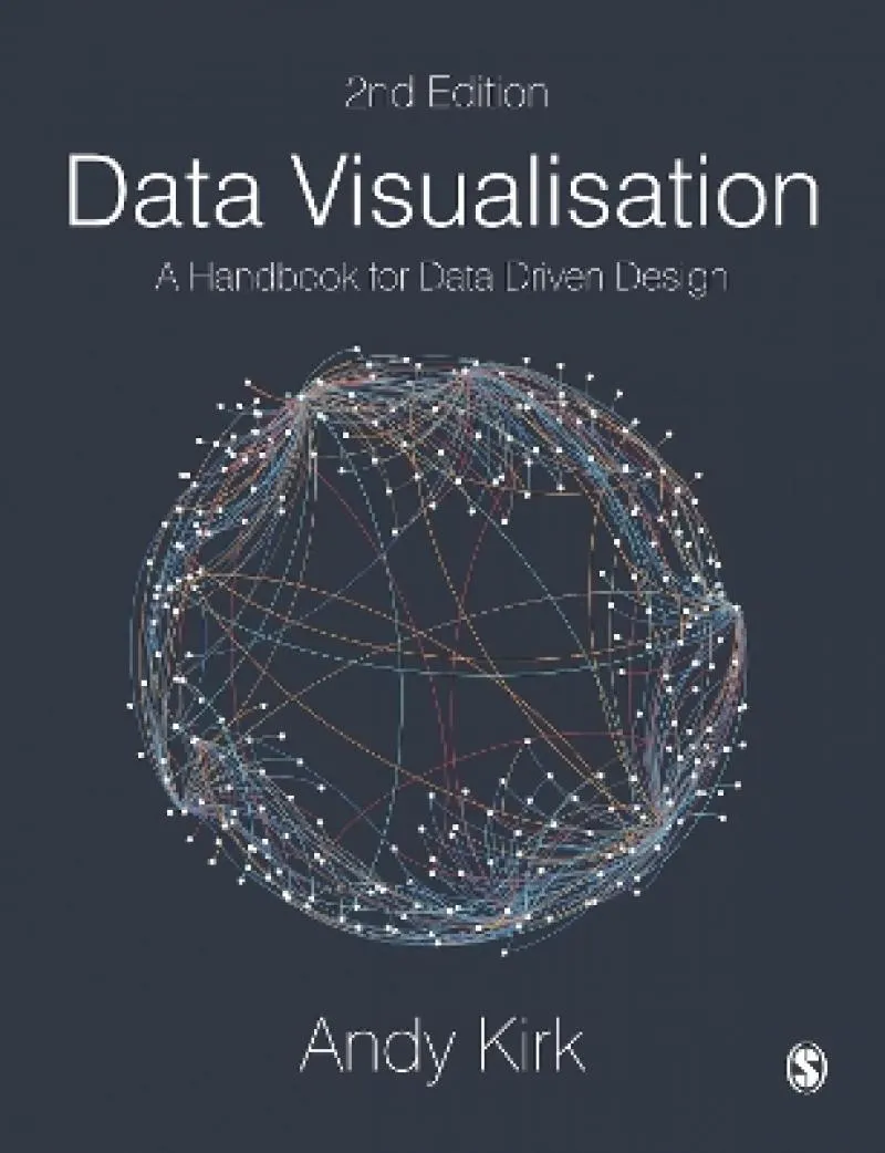
The authors write as practitioner-educators with a Swiss information-design lineage: concise, example-led, and focused on decisions you can defend. Attribution note: do not confuse this title with Andy Kirk’s Data Visualisation: A Handbook for Data Driven Design, which is a different book.
Key Themes
Question-first design; modular building blocks; perceptual honesty; hierarchy and rhythm on the page; multi-view narratives for complex subjects.
Strengths and Weaknesses
Strengths: systematic process, reusable components, and practical guidance on typography, grids, and annotation. Weaknesses: light statistics and limited code examples; you will need other sources for inference and tooling.
Target Audience
Information designers, data journalists, policy and product teams, and educators who need a repeatable way to turn dense material into legible visuals.
Favorite Ideas
From text to data as an explicit step; variable hierarchies that rank encodings by reliability; multi-panel layouts that separate overview, pattern, and exception; label and legend planning before layout.
Takeaways
Design the thinking first, then the chart. Choose encodings that match the reader’s tasks, compose with hierarchy and whitespace, and prototype alternatives to prove what is easiest to read. Clarity is a process you can run, not a lucky accident.

