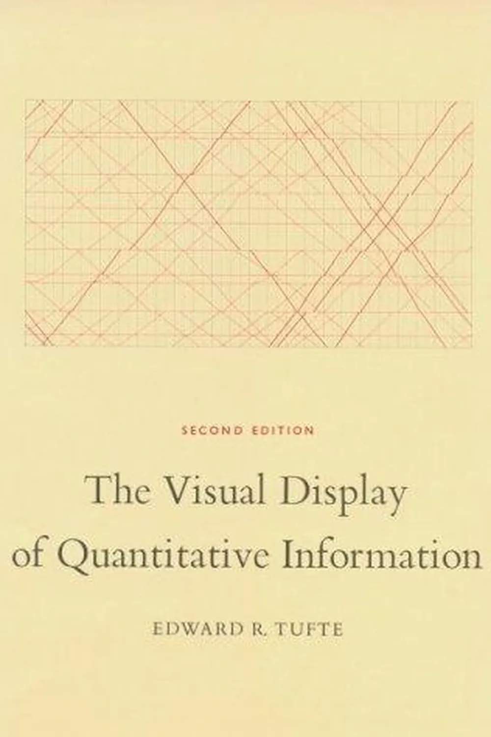
The Visual Display of Quantitative Information Review
The Visual Display of Quantitative Information by Edward R. Tufte is a foundation text for statistical graphics: how to show data with integrity and clarity. It argues for truthfulness, economy, and density. The book reads like a style guide for evidence and a manifesto against distortion.
Overview
Tufte surveys historical exemplars and common failures, then codifies principles for designing graphs and tables. Topics include proportional encoding, scales, typography, and layout. The emphasis is on print era constraints, but the rules generalize: remove nonessential ink, raise data density, and make comparisons easy.
Summary
Key constructs: graphical excellence, graphical integrity, the lie factor, data ink and its ratio, chartjunk, data density, and layering for comparison. He dissects bar, line, and area charts, warns about truncated axes and inconsistent scales, and praises classic works such as Playfair’s charts and Minard’s Napoleon map. Examples show how small design choices alter inference and how to build trustworthy graphics from first principles.
Authors
Edward R. Tufte is a statistician and political scientist known for clear writing and rigorous examples. His approach blends history, aesthetics, and quantitative reasoning. The prose is concise and the illustrations do the teaching.
Key Themes
Integrity before effect. Proportional representation of quantities. Reduction of non data ink. High data density without clutter. Comparisons as the core of insight. Typography and spacing as analytical tools, not decoration.
Strengths and Weaknesses
Strengths: sharp principles, memorable tests like the lie factor, and evergreen case studies. It gives a durable checklist for honest charts. Weaknesses: limited empirical validation, little on color accessibility or interaction, and guidance shaped by print constraints. Treat it as a baseline to extend in digital contexts.
Target Audience
Analysts, designers, product managers, scientists, and editors who build or judge charts. If you review dashboards, write reports, or set visualization standards, this book earns a permanent spot on your desk.
Favorite Ideas
Lie factor as a quick audit for distortion. Data ink ratio as a pressure test for minimalism. Chartjunk as a taxonomy of distractions. Data density as a virtue when paired with clear structure. Minard’s map as a master class in layered evidence.
Takeaways
Show the data, show it honestly, and make comparisons effortless. Use scales that match quantities, label clearly, remove ornament, and design for inference. If a reader can verify the claim with their eyes and numbers agree with geometry, the display succeeds.

