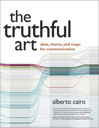
The Truthful Art: Data, Charts, and Maps for Communication Review
The Truthful Art by Alberto Cairo is a manifesto for honesty in visualization: accuracy, clarity, and empathy for readers. It blends journalism, statistics, and design to show how to reason with data and communicate evidence without distortion.
Overview
Cairo walks through the analytical pipeline: question framing, data collection and cleaning, statistical reasoning, chart selection, and annotation. Case studies and exercises illustrate how to avoid common traps and how to explain uncertainty.
Summary
Core ideas: define claims, validate data, choose encodings that match tasks, and label plainly. Cairo covers distributions, comparisons, relationships, and time series; warns against misleading scales and cherry-picking; and promotes transparency via sources and methods notes.
Authors
Alberto Cairo is a journalist and professor known for clear, ethical standards in visualization. He teaches with examples, counterexamples, and checklists.
Key Themes
Truthfulness before aesthetics; statistical thinking as design input; uncertainty and context; reader-centered explanations; iterative critique.
Strengths and Weaknesses
Strengths: ethical grounding, accessible stats, and practical guidance. Weaknesses: limited code depth and advanced modeling; some newsroom examples may feel dated but remain instructive.
Target Audience
Journalists, analysts, product teams, and educators who communicate findings to broad audiences and must balance rigor with clarity.
Favorite Ideas
“Annotation is explanation”; proportional scales as default; showing uncertainty honestly; sourcing as part of the graphic.
Takeaways
Start with the claim, check the data, choose honest encodings, and annotate for understanding. Beauty follows truth when the visual carries the argument clearly.

