Envisioning Information Review
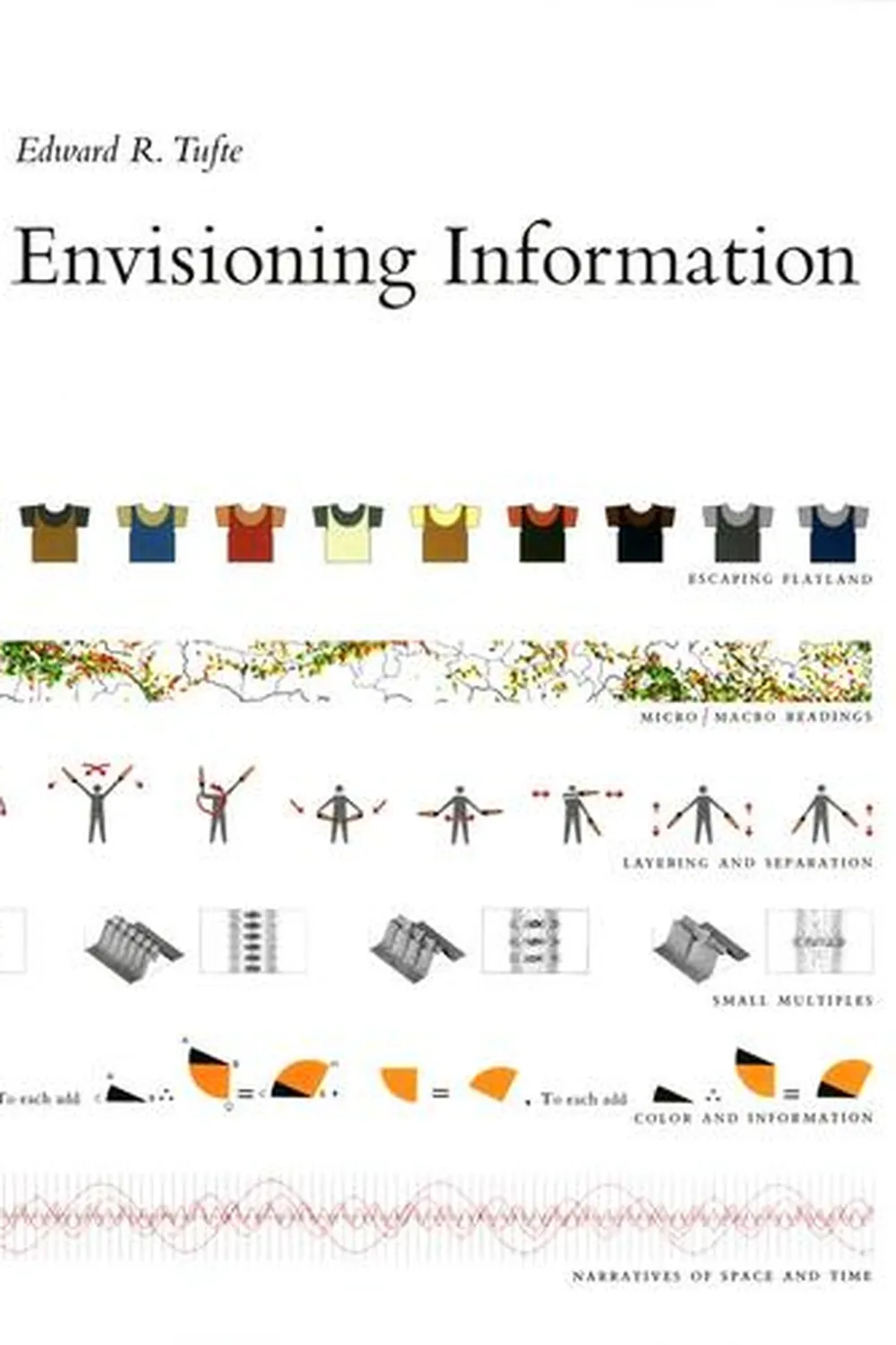
Envisioning Information by Edward R. Tufte is a compact lesson in how to display rich, multivariate data with grace and truth. It focuses on layering, separation, and microtypography so dense information remains legible. The goal is not decoration. The goal is seeing relationships that numbers alone hide.
Overview
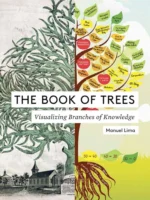
Tufte explores techniques for showing many variables at once: small multiples, color as a quantitative cue, and annotations that clarify without clutter. He analyzes maps, scientific plates, timetables, and flight charts to extract reusable principles for arrangement, labeling, and narrative structure.
Summary
Core ideas include layering and separation with rules, tint, and whitespace. Small multiples for fast comparison. Microtype and table design that privilege reading order. High resolution data within low resolution displays. Avoid chartjunk and optical noise. Use color sparingly and purposefully. Confections of detail are encouraged when they improve reasoning and do not overload the eye.
Authors
Edward R. Tufte combines statistics, design, and historical examples. His pages teach by juxtaposition: before and after, failure and fix. The writing is economical and the evidence is visual first.
Key Themes
Layer information so the eye can parse it in steps. Use small multiples to reveal change and variation. Typography is a tool for analysis. Color is for coding and emphasis, not decoration. Explanatory legends belong near the data. Clutter is not complexity. Clarity can coexist with density.
Strengths and Weaknesses
Strengths: timeless examples, concrete rules for separators, grids, and labels, and a rigorous defense of simplicity with depth. Weaknesses: minimal coverage of interactive and screen based constraints, limited guidance on accessibility and color blindness. Treat it as a print born foundation that still guides modern dashboards and maps.
Target Audience
Designers, analysts, cartographers, product managers, scientists, and editors who must present layered evidence. Teams that set visualization standards or review complex graphics will find a durable reference.
Favorite Ideas
Small multiples as visual sentences. Layering with hairlines and soft tints to separate content. Data rich maps that integrate labels into geometry. Sparklines as intense, word sized graphics for time series. The principle: annotate data, not margins.
Takeaways
Show many things clearly and at once. Build with layers, align comparisons, keep legends close, and let typography carry structure. Use color and rules to separate without shouting. When readers can scan, compare, and conclude in a few seconds, the design is doing analytical work.