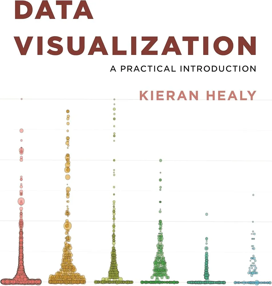
Data Visualization: A Practical Introduction Review
Data Visualization: A Practical Introduction by Kieran Healy is a clear, opinionated guide to making readable charts with modern R tools. It blends perceptual basics with a reproducible workflow so that good taste is backed by code, not vibes.
Overview
The book teaches a grammar-of-graphics approach using ggplot2, tidy data with the tidyverse, and literate analysis via R Markdown. Topics include choosing encodings, scales and guides, color and accessibility, small multiples, maps, and publication-ready theming.
Summary
Healy starts with why charts work, then standardizes data into tidy form and builds from simple bar and line charts to faceted comparisons and cartography. Along the way he shows how to design axes, annotations, and legends that reduce cognitive load. Case studies walk from messy tables to clean plots with minimal ink and maximum signal.
Authors
Kieran Healy, a sociologist with strong design instincts, writes plainly and teaches by example. Code and figures are consistent and replicable.
Key Themes
Question-first design; position and length over angle and area; small multiples beat overloaded single charts; accessibility and colorblind-safe palettes; reproducibility as part of design.
Strengths and Weaknesses
Strengths: crisp principles, practical R code, strong emphasis on annotation and layout. Weaknesses: focused on R (limited Python/JS) and light on statistical inference or interactive dashboards.
Target Audience
Analysts, social scientists, policy teams, and students who want a fast, reliable path to publication-grade charts in R.
Favorite Ideas
Facet to compare, don’t cram; label directly when possible; start in grayscale, add color only when it carries information.
Takeaways
Make tidy data, choose the simplest encoding that answers the question, annotate generously, and iterate in code. Clarity comes from disciplined choices you can reproduce end to end.

