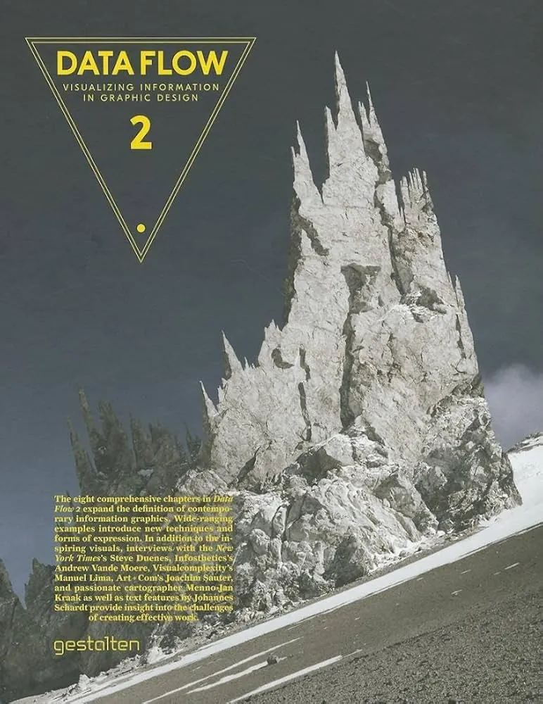
Data Flow: Visualising Information in Graphic Design Review
Data Flow by Robert Klanten, Nicolas Bourquin, and Thibaud Tissot is a curator’s tour of information design in the wild: posters, editorial spreads, installations, and experimental graphics that turn data into form. It is inspiration with commentary—less a textbook, more a showcase that teaches by example.
Overview
The book spans maps, timelines, networks, typographic systems, and generative pieces. Projects are contextualized with short briefs: goals, sources, encoding choices, and production notes. You see how constraints of print and space drive inventive solutions.
Summary
Patterns emerge: clear hierarchy, disciplined grids, and restrained palettes that guide perception. Many works leverage layering, small multiples, and annotation to maintain readability at high density. Others push aesthetics to provoke, trading some precision for narrative impact.
Authors
Klanten, Bourquin, and Tissot edit with a designer’s eye. The selections privilege craft and concept, offering enough process detail to be useful for practitioners.
Key Themes
Form follows task; typography as structure; grids that tame complexity; narrative as a frame for numbers; print constraints as a source of creativity.
Strengths and Weaknesses
Strengths: broad, high-quality cases and practical layout ideas. Weaknesses: limited statistics and code; web accessibility and interactivity receive little attention. Treat it as a pattern library.
Target Audience
Graphic designers, editors, art directors, and analysts seeking real-world layouts and encodings to adapt.
Favorite Ideas
Typographic scales that double as data scales; modular grids that support small multiples; annotation that earns space by clarifying insight.
Takeaways
Great information design blends concept, hierarchy, and craft. Start with the message, choose encodings that match it, and let layout and type carry structure.