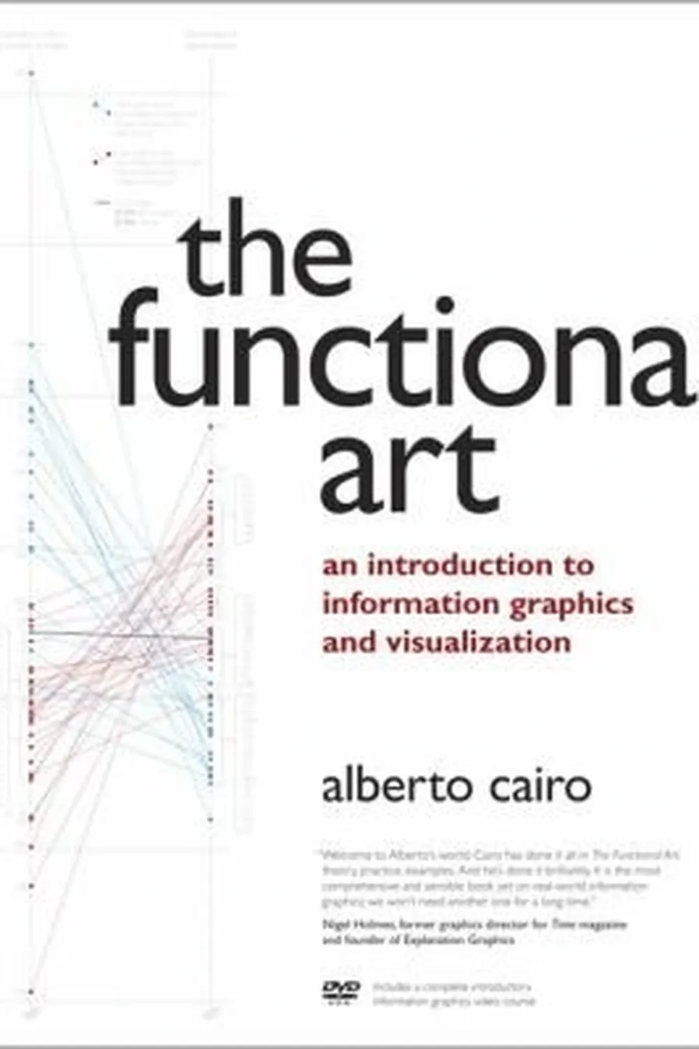
The Functional Art: An Introduction to Information Graphics and Visualization Review
The Functional Art by Alberto Cairo is a designer’s manual grounded in journalism: visuals must be useful, truthful, and humane. It blends theory, cognitive science, and newsroom practice to show how to plan, design, and explain graphics that help people think.
Overview
The book moves from principles to process: perception basics, choosing the right graphic form, narrative structure, and newsroom case studies. It includes interviews with practitioners and annotated examples that expose tradeoffs and constraints.
Summary
Cairo frames visualization as a form of explanation. He covers encoding choices, hierarchy, and annotation, then shows how to storyboard, prototype, and test. You learn to align tasks with forms: comparisons, distributions, relationships, and change over time. Ethical guidelines stress accuracy, proportionality, and clear sourcing.
Authors
Alberto Cairo is a journalist and professor known for lucid teaching and pragmatic standards. He writes with empathy for readers and discipline for evidence. Examples come from real deadlines and messy data.
Key Themes
Function before form. Readers first: perception and tasks guide design. Honesty in scale and sourcing. Narrative structure that frames exploration. Iteration and feedback as core to craft.
Strengths and Weaknesses
Strengths: accessible theory, real world cases, and practical checklists. It bridges design and reporting. Weaknesses: limited code depth and only light treatment of advanced analytics. Pair it with technical resources if you build complex systems.
Target Audience
Journalists, product teams, designers, and analysts who must communicate findings to non experts. Editors and managers can use its checklists to set standards.
Favorite Ideas
Task first form selection. Annotation that earns its space. Ethical framing: cite sources, show uncertainty, avoid sensational scales. Storyboards to align stakeholders before you code.
Takeaways
Design for understanding. Start with the reader’s question, pick forms that fit the task, label and source plainly, and test with real people. Beauty follows function when the graphic carries the argument clearly.

