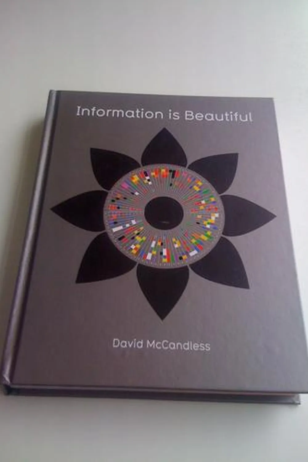
Information is Beautiful Review
Information is Beautiful by David McCandless is a gallery of ideas: data turned into clear, memorable visuals. It blends curiosity with skepticism. The point is not just pretty charts. The point is structured thinking that forces you to ask: what is the claim, what is the scale, what is the source. If you work with public facts, this book is a visual playbook and a reality filter.
Overview
The book is organized by themes like health, technology, media, money, and the planet. Each spread is a self-contained analysis: question, dataset, encoding, takeaway. You get comparisons, rankings, maps, timelines, and layered diagrams. The layout emphasizes hierarchy and annotation so the reader can scan first, then drill down.
Summary
McCandless collects open data, cleans it, and experiments with encodings: size for magnitude, position for order, color for grouping, small multiples for comparison. Many pieces visualize uncertainty or disagreement across sources. Others are cautionary: correlation versus causation, cherry picking, and scale confusion. The rhythm is consistent: define the frame, reveal a pattern, disclose the source.
Authors
David McCandless is a data journalist and designer. His background in writing and the web shows: each graphic reads like a tight article with a headline, nut graph, and receipts. He prioritizes clarity, cites sources, and uses design to make skepticism accessible.
Key Themes
Clarity over decoration. Scale literacy: orders of magnitude matter. Context and caveats: what is missing is as important as what is shown. Design as reasoning: typography, spacing, and color guide interpretation. Curiosity as method: good questions produce better graphics than clever effects.
Strengths and Weaknesses
Strengths: wide topic range, crisp art direction, and strong source transparency. It teaches by example how to encode comparisons, uncertainty, and trade offs. Weaknesses: some spreads compress complex methods into a single image, time series can be sparse, and not every dataset meets analytical depth. Treat it as inspiration plus prompt to dig deeper.
Target Audience
Designers, analysts, product managers, educators, and journalists who need to turn messy facts into communicable insights. Also useful for executives who must judge charts quickly and ask better follow up questions.
Favorite Ideas
Billion Dollar O Gram: money at human scale. Snake Oil: evidence quality across supplements. Colours in Culture: meaning varies by context. Hierarchies that reveal hidden categories and gaps. These pieces model how to show scale, uncertainty, and cultural nuance.
Takeaways
Good visuals compress learning. Start with a question, gather multiple sources, choose encodings that match the claim, label plainly, and disclose uncertainty. Beauty is not the goal. Comprehension is. If your reader can retell the insight in one sentence, the graphic worked.